Equity Curve: A Python Library for Professional Strategy Analysis
Tools Documentation
equity-curve is a Python library for quantitative analysts and portfolio managers. It covers the full strategy analysis pipeline — from raw NAV data to interactive dashboards — with 30+ risk metrics, econometric tests, and Plotly visualisations.
Antoine
CEO - CodeMarketLabs
2026-03-10
equity-curve: A Python Library for Professional Strategy Analysis
equity-curve is a Python library designed for quantitative analysts and portfolio managers who need a rigorous, modular framework to evaluate trading strategies. Built on top of pandas and plotly, it covers the full analysis pipeline — from raw NAV data to publication-ready dashboards — with a consistent API and professional-grade visualisations. Every module is independently usable: you can call a single ratio function, run a battery of econometric tests, or generate a full interactive dashboard with one line.
What the library provides
Core data structures with built-in validation for price series and portfolio data.
Interactive Plotly dashboards exportable to HTML or PNG, dark and light themes.
1. Core Data Structures
The library is built around three classes. PriceSeries is the abstract base — it validates the index, sorts data, and warns on duplicates. TimeSeries extends it with return computation (normal or log). PortfolioTs enforces the three-column contract required by all downstream functions: strategy, benchmark, and risk_free.
python
import pandas as pd
from equity_curve.utils.financial_ts import TimeSeries, PortfolioTs
# --- Single series ---nav = pd.Series([100,101,99,103,106], index=pd.date_range('2024-01-01', periods=5))ts = TimeSeries(nav)print(ts.get_returns('normal'))# pct_change, dropnaprint(ts.get_returns('log'))# log(p_t / p_t-1), dropnaprint(ts)# PriceSeries(name=None, start=2024-01-01, end=2024-01-05, n=5)# --- Portfolio (required for all ratio / performance functions) ---df = pd.DataFrame({'strategy':[100,102,101,105,108],'benchmark':[100,101,100,103,105],'risk_free':[100,100.01,100.02,100.03,100.04]}, index=pd.date_range('2024-01-01', periods=5))portfolio = PortfolioTs(df)print(portfolio)# PriceSeries(columns=['strategy', 'benchmark', 'risk_free'], start=2024-01-01, end=2024-01-05, n=5)# Missing column raises immediatelytry: PortfolioTs(df.drop(columns=['risk_free']))except ValueError as e:print(e)# Missing required columns: ['risk_free']
2. Configuration & Theming
config.py centralises all visual constants. Strategy and benchmark colours are defined once and used everywhere — in charts, tables, and annotations. The THEMES dict controls the full Plotly appearance. Every chart function accepts a mode parameter ('dark' or 'light') so you can switch without touching any other code.
python
# config.py — customise to match your brandCOLOR_STRAT ='#007668'# teal greenCOLOR_BENCH ='#b20462'# magentaCOLOR_RF ='#ffde59'# yellow dashedCOLOR_RED ='#ef0032'COLOR_GREEN ='#00ef4a'THEMES ={'dark':{'TEMPLATE':'plotly_dark','BG_COLOR':'#0f1117','COLOR_GRID':'rgba(255,255,255,0.06)','COLOR_TEXT':'#ffffff'},'light':{'TEMPLATE':'plotly_white','BG_COLOR':'#ffffff','COLOR_GRID':'rgba(0,0,0,0.06)','COLOR_TEXT':'#000000'}}# Usage — pass mode to any chartfrom equity_curve.graphs import plot_performance
plot_performance(perf, mode='dark').show()plot_performance(perf, mode='light').show()
3. Performance Metrics
The Performances class wraps a PortfolioTs with a computation_date and a basis (number of periods per year). It acts as the single object passed to all metric functions. Period returns handle calendar edge cases: if the exact target date is missing, the function looks back up to 5 days for a valid observation.
python
from datetime import datetime
from equity_curve.performances import( Performances, cagr, wtd_perf, mtd_perf, ytd_perf, one_month_perf, three_month_perf, since_inception_perf, track_record, seasonality_analysis, hit_ratio, avg_win_loss
)perf = Performances( strat=portfolio, computation_date=datetime(2024,12,31), period_per_year=252# trading days)# Period returns — all return {'strategy': x, 'benchmark': y, 'risk_free': z}print(wtd_perf(perf))# week-to-dateprint(mtd_perf(perf))# month-to-dateprint(ytd_perf(perf))# year-to-dateprint(three_month_perf(perf))# rolling 3 monthsprint(since_inception_perf(perf))# full periodprint(cagr(perf))# compound annual growth rate# Track record — years x months pivotprint(track_record(perf))# Seasonalitymonthly = seasonality_analysis(perf, frequency='M')# Jan–Dec avg returnsdaily = seasonality_analysis(perf, frequency='D')# Mon–Fri avg returns# Win/Loss statsprint(hit_ratio(perf))# 0.54 — 54% of days positiveprint(avg_win_loss(perf))# {'avg_win': 0.008, 'avg_loss': -0.006}
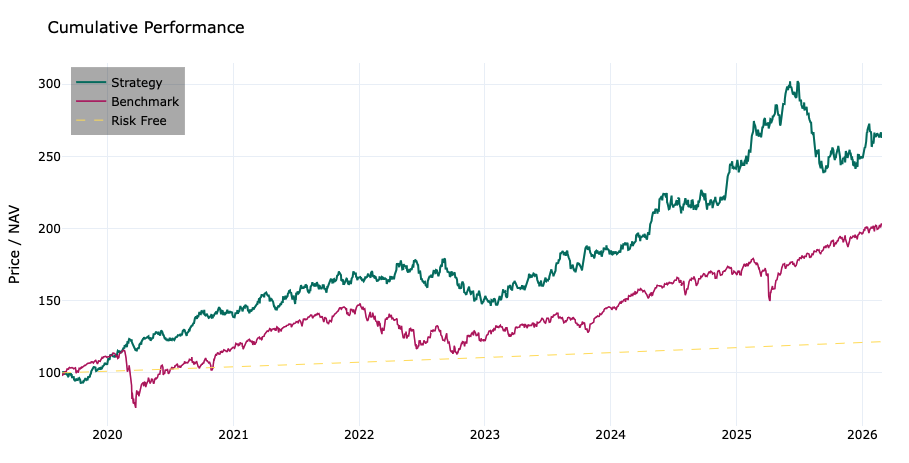
Graphs des performances relatives
4. Statistics
The statistics module operates on any TimeSeries object and covers the full spectrum of distributional analysis. All functions accept an r_type parameter ('normal' or 'log') and an optional annualization flag. They work on both Series and DataFrame inputs.
python
from equity_curve.statistics import( mean_returns, standard_deviation, skewness, kurtosis, downside_deviation, upside_deviation, iqr, mad, entropy, percentile, zscore, coefficient_of_variation
)ts = TimeSeries(df['strategy'])# Momentsprint(mean_returns(ts, annualized=True))# annualised mean returnprint(standard_deviation(ts, annualized=True))# annualised volprint(skewness(ts))# -0.42 — slight left skewprint(kurtosis(ts))# 3.81 — excess kurtosis, fat tails# Tail & dispersionprint(downside_deviation(ts))# sqrt(mean of negative squared returns)print(upside_deviation(ts))# sqrt(mean of positive squared returns)print(iqr(ts))# Q75 - Q25print(mad(ts))# median absolute deviationprint(percentile(ts,0.05))# 5th percentile — proxy for VaR# Distribution qualityprint(entropy(ts, bins=50))# Shannon entropyprint(coefficient_of_variation(ts))# std / |mean|print(zscore(ts, prices=False).tail(3))# z-score on returns
5. Risk Ratios
pm_ratios.py covers every major risk-adjusted performance metric. Functions return a dict keyed by column name so strategy and benchmark are always computed together. The all_ratios() function computes everything at once and includes a plain-English description of each metric.
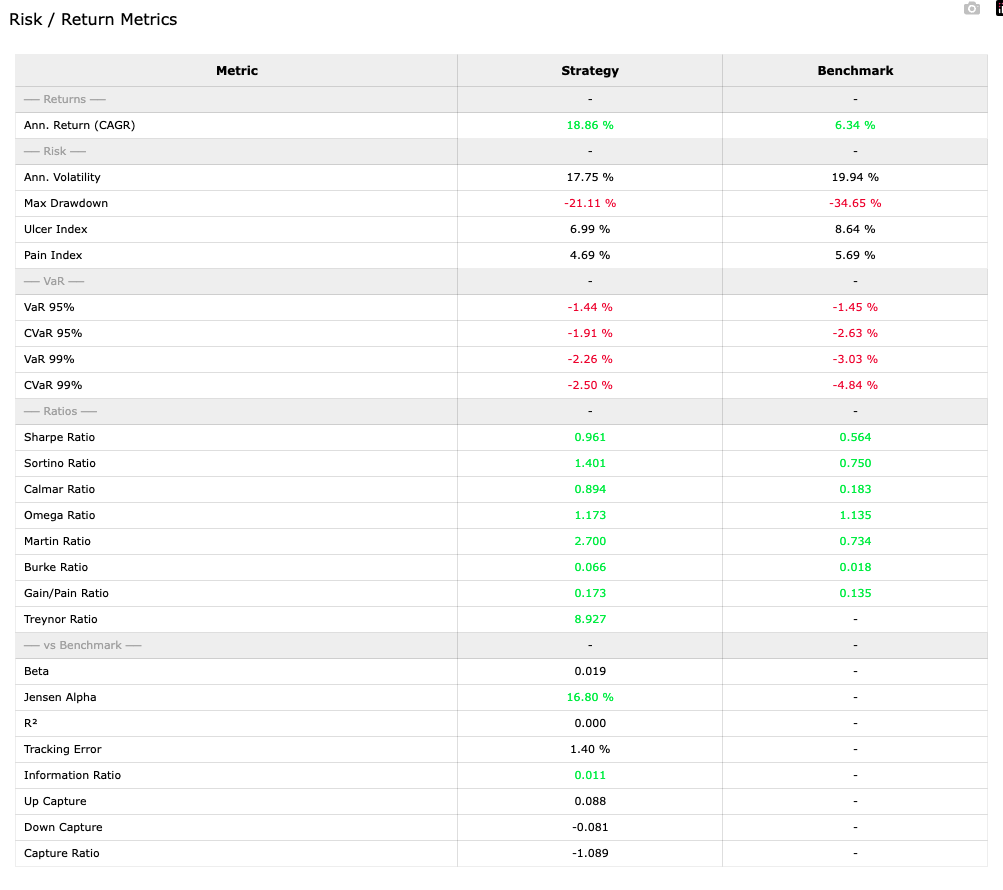
Table complète des métriques de rendement et de risque
6. Econometric Tests
The econometric_tests module provides a consistent interface for hypothesis testing. All functions return the same structured dict: stat, p-value, test_results (a human-readable verdict), and a details block with description, H0, and H1. Univariate tests work on both Series and DataFrame inputs. Multivariate tests require exactly 2 columns.
graphs.py exposes a standalone Plotly figure for every analysis module, and a dashboard() function that assembles all of them into a single scrollable figure. The _add() helper intelligently routes xy and table traces to the correct subplot type, so the layout is fully automatic. Export to HTML preserves full interactivity; PNG export uses kaleido.
python
from equity_curve.graphs import( plot_performance, plot_underwater, plot_drawdowns, plot_rolling_sharpe, plot_rolling_volatility, plot_rolling_beta, plot_rolling_correlation, plot_annual_returns, plot_returns_histogram, plot_seasonality, table_perf, table_ratios, table_track_record, table_returns_stats, dashboard, export_dashboard, export_dashboard_png
)# Individual chartsplot_performance(perf, mode='dark').show()plot_drawdowns(perf, top_n=5, mode='dark').show()plot_rolling_sharpe(perf, window=90, mode='dark').show()plot_seasonality(perf, frequency='M', mode='dark').show()# monthly avg returnsplot_seasonality(perf, frequency='D', mode='dark').show()# day-of-week avg returns# Individual tablestable_perf(perf, mode='dark').show()table_ratios(perf, mode='dark').show()table_track_record(perf, mode='dark').show()# Full dashboard — assembles all charts + tablesfig = dashboard( perf, window_roll=90,# rolling window in days top_dd=5,# number of top drawdowns to highlight mode='dark', title='Global Portfolio Strategy')fig.show()# opens in browser, scrollable# Exportexport_dashboard(perf,'report.html', title='Global Portfolio Strategy')export_dashboard_png(perf,'report.png', title='Global Portfolio Strategy')
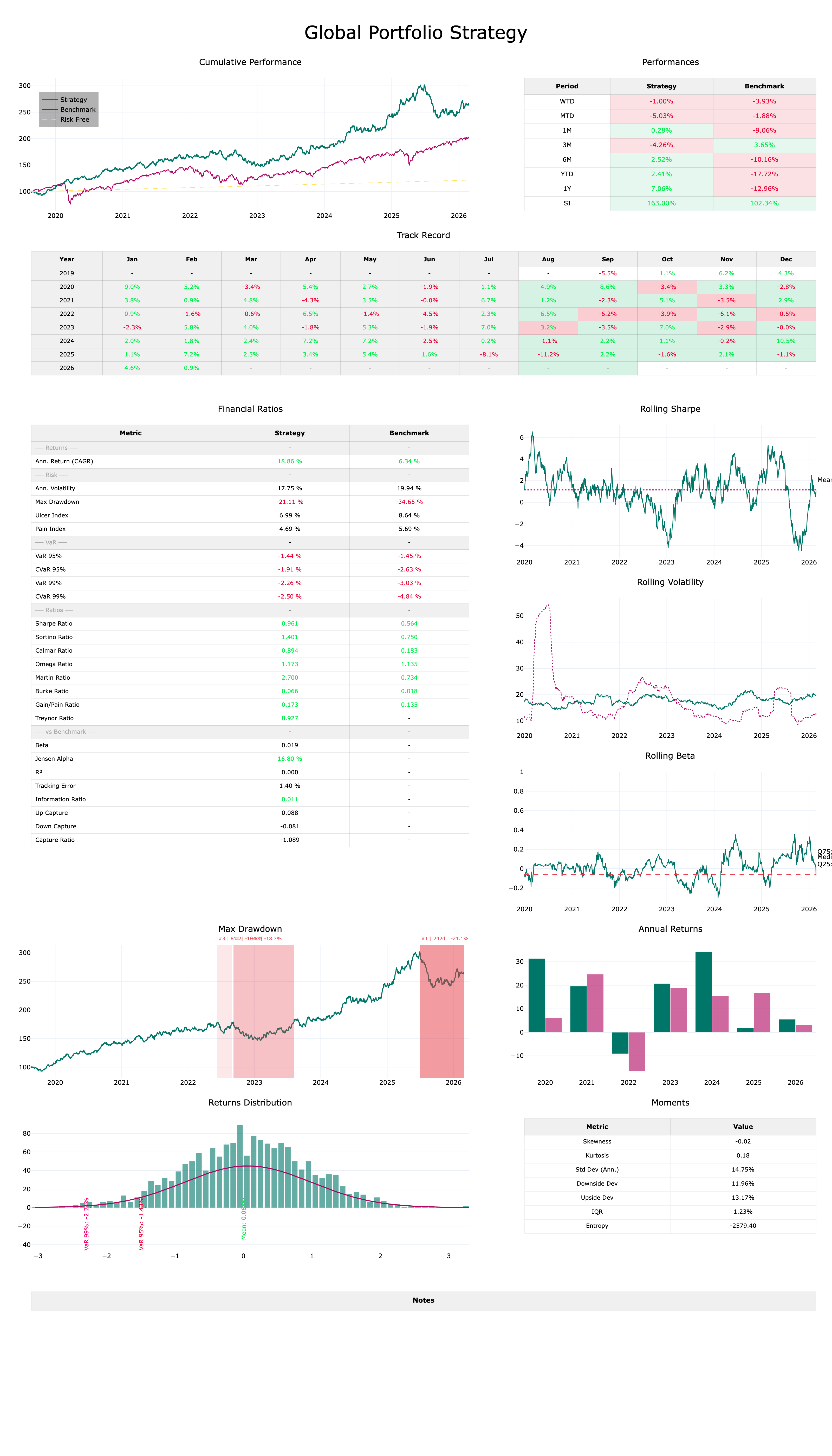
Dashboard Complet
Get equity-curve
equity-curve is available as a standalone Python package. Whether you are running a systematic strategy, analysing a discretionary fund, or building performance reports for clients, the library gives you a production-ready analytical stack in a few lines of code.
What you get
Full source code with typed, documented functions.
Dark and light theme dashboards exportable to HTML and PNG.
30+ risk and performance metrics with strategy vs benchmark comparison.
Full econometric test suite: univariate and multivariate.
Lifetime updates — new ratios and charts added regularly.
What data format does equity-curve require?
A pandas DataFrame with a DatetimeIndex and three columns: strategy, benchmark, and risk_free — all as price/NAV series starting at any base value (e.g. 100). The index must be parseable as dates; the library will convert strings automatically.
Can I use it with daily, weekly or monthly data?
Yes. Set period_per_year accordingly when instantiating Performances: 252 for trading days, 365 for calendar days, 52 for weekly, 12 for monthly. All annualisation in ratios and rolling charts uses this basis automatically.
Does it work in Jupyter?
Yes. All charts are Plotly figures and render inline in JupyterLab or classic notebooks. For the full dashboard, fig.show() opens it in your browser where the large figure is natively scrollable.
Can I use only part of the library without the rest?
Yes. Every module is independently importable. You can use only pm_ratios for ratio computations, only econometric_tests for hypothesis testing, or only graphs for a specific chart — without instantiating the full Performances object.
How do I customise chart colours and themes?
Edit config.py to set COLOR_STRAT, COLOR_BENCH, and the THEMES dict. Every chart picks up these values automatically via the mode parameter. No other changes are needed.